Parking Availability Design
🧭 Designing the Parking Availability Prediction Page
Part of the SmartParkSD Project
🎯 Purpose of the Page
The Prediction Page is the heart of the SmartParkSD user experience.
Its primary goal is to empower users with data-driven insight into parking availability before they arrive at a destination.
Instead of aimlessly circling for an open meter, drivers are given clear, actionable predictions—based on real usage data and machine learning.
🧱 Page Goals & Core Features
🧠 What should this page do?
- ✅ Convert user address → geographic coordinates
- ✅ Find closest meter(s) based on proximity
- ✅ Accept user-chosen day and time
- ✅ Display clear prediction on availability
- ✅ Allow sorting and viewing of alternatives
- ✅ Support user feedback to improve predictions
- ✅ Deliver all of this in an intuitive, mobile-friendly UI
🖼️ Visual Design Overview
🎨 Preview of our Figma Design:
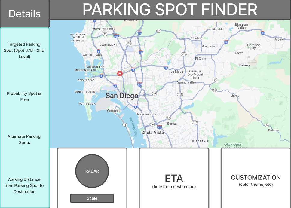
The design is built around user clarity and speed—because users will often access this on-the-go.
✍️ Design Breakdown
🔍 1. Search Panel (Top Section)
Function:
Let users enter an address or use their GPS to pinpoint a location.
Design Elements:
- Search bar with auto-suggest
- Button for “Use My Location”
- Google Maps or Leaflet.js geocoder integration
- Displays the address and coordinates once found
Why It Matters:
We want to reduce friction; users shouldn’t need to know coordinates or pole IDs—just type and go.
🕒 2. Day & Time Picker
Function:
Allow users to specify when they want to park.
Design Elements:
- Dropdowns or calendar/time inputs
- Defaults to current time, but easy to change
- Backend formats this for prediction input (e.g., weekday/hour)
Why It Matters:
Parking demand varies wildly depending on day and hour—this is core to accurate prediction.
🗺️ 3. Prediction Heatmap (Center Section)
Function:
Display nearby meters as color-coded markers or zones based on availability predictions.
Design Elements:
- Map using Leaflet.js or Google Maps
- Color scale:
- 🟢 Green = High chance of availability
- 🟡 Yellow = Medium chance
- 🔴 Red = Low chance
- Hovering or clicking reveals a prediction popup
Why It Matters:
Maps are intuitive. A visual glance tells you where to go.
📊 4. Prediction Details Popup
Function:
When a user clicks a meter, it shows full prediction info.
Design Elements:
- Meter ID / Street
- Confidence score (e.g. “77% likely available”)
- Typical occupied times
- Cost info (if applicable)
- Last updated timestamp
- Optional chart of past patterns
Why It Matters:
Adds trust. Users want to know why the model says what it says.
📋 5. Availability Table View (Below Map)
Function:
For users who prefer a sortable, list-based view of nearby options.
Design Elements:
-
Columns: Meter ID Distance Prediction Cost - Sort/filter controls (e.g., by availability, distance)
- Suggest alternative meters if top ones are full
Why It Matters:
Accessibility: Not everyone wants to interact with a map.
✍️ 6. Feedback Panel
Function:
Let users report back if a prediction was wrong (or right).
Design Elements:
- “Was this prediction correct?” → 👍 / 👎
- Optional comment box
- Feedback sent to backend for model improvement
Why It Matters:
Allows human-in-the-loop learning. Feedback is gold for model refinement.
🔐 Optional: Logged-In Features
When a user is authenticated:
- ⭐ Bookmark favorite spots
- 🔔 Set availability alerts for specific poles
- 📊 View past search history
These features are visible in the top navbar or via modals.
🛠️ Technical Considerations
| Component | Tech Used |
|---|---|
| UI Framework | Bootstrap |
| Mapping | Leaflet.js + heatmap layer |
| Geocoding | Google Maps API or OpenCage |
| State Management | JavaScript / React state |
| Prediction Source | Flask API returning model results |
| Feedback Logging | Backend endpoint to store reports |
🧪 Mobile-First Focus
We tested layouts using mobile breakpoints and ensured:
- Forms collapse vertically
- Map resizes responsively
- Buttons are large and tappable
Most people check parking while already driving or walking, so this page must load fast and feel native on a phone.
🎯 Success Criteria
- ✅ Address → location → prediction = seamless
- ✅ Users understand what the colors & scores mean
- ✅ Everything loads fast and is responsive
- ✅ Feedback is collected painlessly
- ✅ Users find it more efficient than guessing
🏁 Final Thoughts
This prediction page brings together all components of SmartParkSD—data science, civic impact, and intuitive design—into one unified experience.
It’s a tool, not just a feature: something that empowers users to plan smarter, save time, and avoid parking pain.